
Use a chart to choose a baseline. Check before the earliest plausible finish, verify the result that matters, and record the adjustment for your appliance. For safety-sensitive foods, doneness—not the timer—is the final decision.
On this page
Generic charts are useful because they reduce a wide search to a plausible temperature and time range. The mistake is treating the final minute as a promise. Most charts describe an unstated test case, and your cook differs whenever one of those hidden assumptions changes.
What a chart usually assumes
- A particular appliance or broad appliance class
- A typical portion arranged in a reasonably even layer
- A common thickness, cut or preparation
- Fresh or frozen state, sometimes left unstated
- A specific preheat convention
- A subjective definition of “done” or “crispy”
If a chart does not state these assumptions, its precision is only apparent. “14 minutes” looks exact, but may simply be the outcome of one appliance, one portion and one preference.
What charts are good for
They are good at establishing order of magnitude: a delicate thin item and a dense thick item clearly do not belong on the same plan. Charts also help identify whether a high, moderate or gentle setting is generally appropriate and whether the cook is likely to need a shake, turn or doneness check.
They are less good at fine adjustment. That is where appliance behavior, quantity, thickness and feedback from previous cooks become more valuable than another chart.
How to use a generic chart well
- Read the row carefully. Match the food form, not only the name. Fries, wedges and a whole potato are different preparations.
- Look for state and quantity. Confirm whether the entry means fresh or frozen and whether your load is much larger.
- Define your target. Tender, browned and very crisp are different finish points.
- Check early. Open the basket before the stated finish when using a new appliance or a thin, fast-cooking item.
- Use the right doneness test. Appearance may be enough for browning vegetables; safety-sensitive foods need an appropriate internal check.
- Save the correction. Note whether your appliance consistently needs less or more time for that setup.
If a chart says a food should finish around a certain time, treat the earlier part as “begin checking” and the later part as “likely finish.” That approach handles natural variation without pretending the estimate is exact.
Adjust one variable at a time
If the outside is too dark but the centre needs longer, lowering temperature and allowing more time may help. If the food is cooked but pale, better spacing, drying the surface or a hotter finishing stage may be more useful than simply adding many minutes. If one side browns faster, add a turn or shake rather than changing the whole setting.
Changing one thing at a time lets you learn what actually improved the result. That learning is the difference between endlessly searching charts and building a dependable method for your own kitchen.
A chart becomes a tailored starting point.
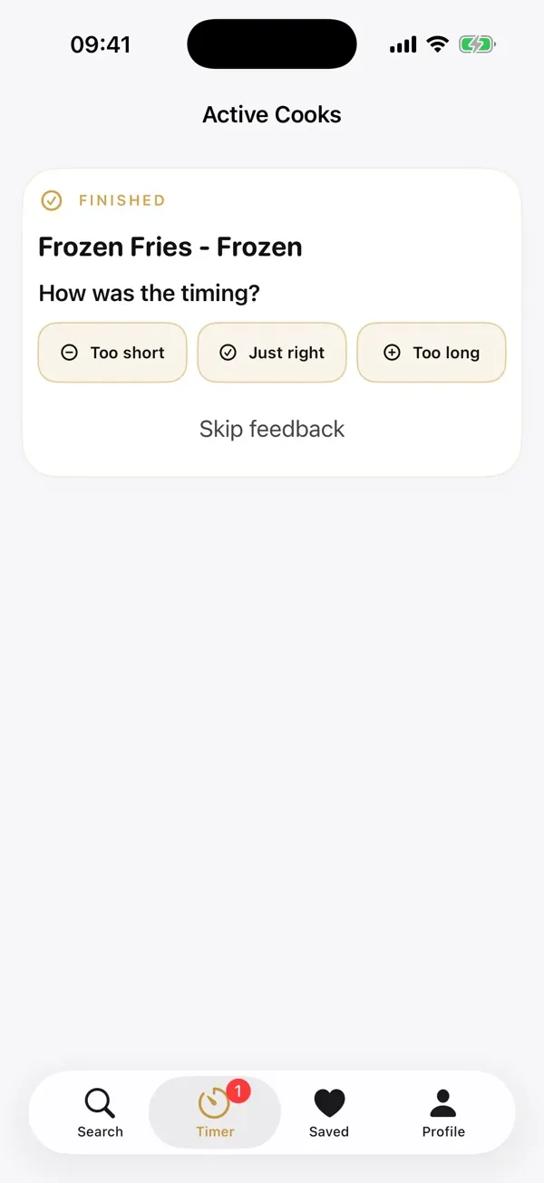
Frygo begins with food-specific cooking knowledge, then adds the information a generic row leaves out: appliance profile, preparation, amount, fresh or frozen state, preferred crispiness and optional preheat. Guided reminders create check points, and your local feedback helps future recommendations fit better.
Your appliance, quantity and preferred crispiness all affect the result. Frygo combines these inputs and guides you through the cook.
These ranges are general guidance, not tested results for every portion and appliance. Use the package and manufacturer instructions for your product and check doneness. Frygo adjusts in-app recommendations to your selections and feedback.
How Frygo creates recommendations →